Process
I worked with our Global Brand Director, Design Director and 2 fellow Product Designers to divy up work needed on the app.
Working with research, I gathered various pain points that current users reported having. Blue sticky notes indicate said ideas, whereas yellow indicate initiatives coined by myself and UXD. All works was informed by 3 three fundamental questions pertaining to dashboard, points and personalization:
- 1. Comprehension: Do members understand what their Points represent?
- 2. Decision-making: Can members quickly determine whether they can afford a food or meal?
- 3. Motivation: Does seeing Points encourage healthier behavior—or create anxiety around staying within a budget?
Overall Work
.png)
My Work
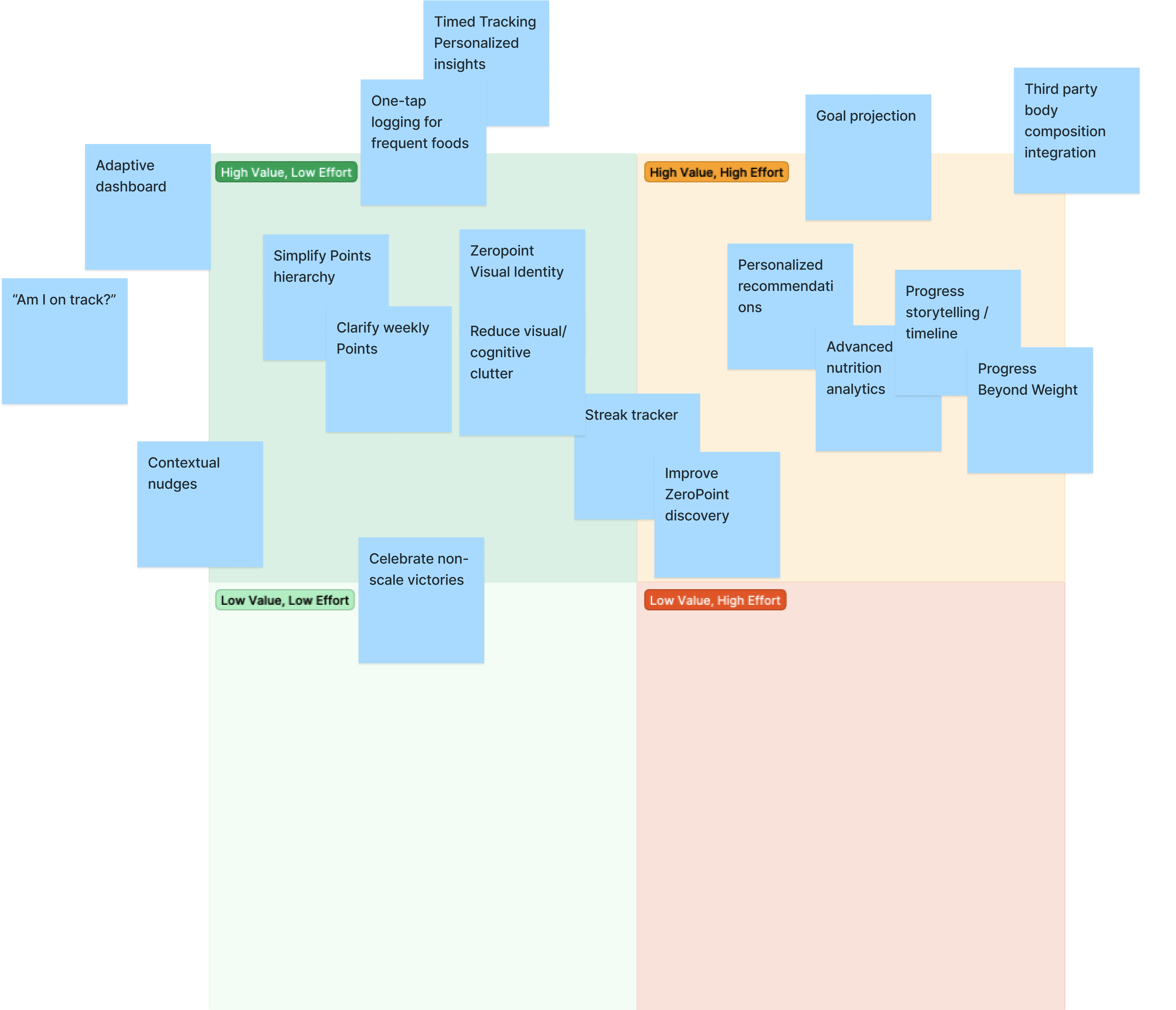
Process
Once I audited the current app and mapped the pain points to specific parts of the current app, I was able to dive into designing and prototyping.
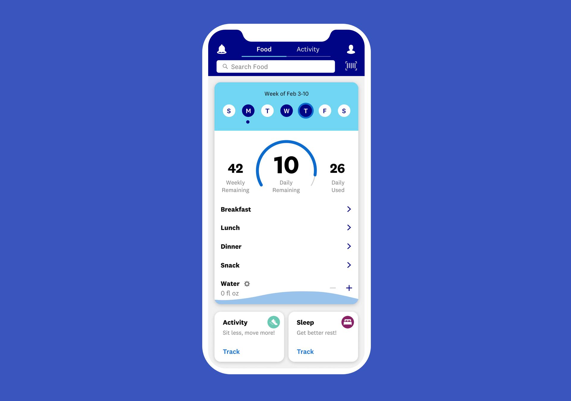
2a. My Day (Dashboard) Redesign
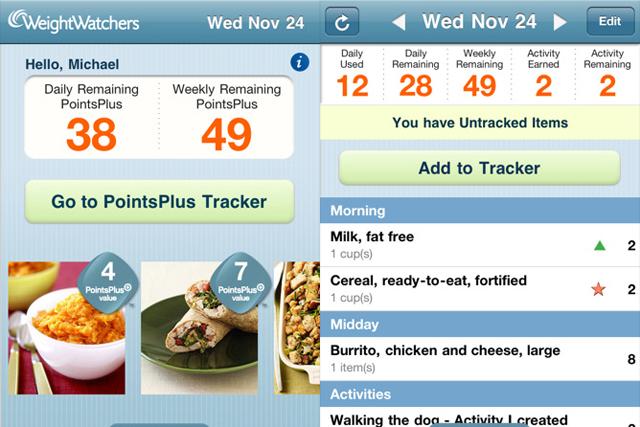
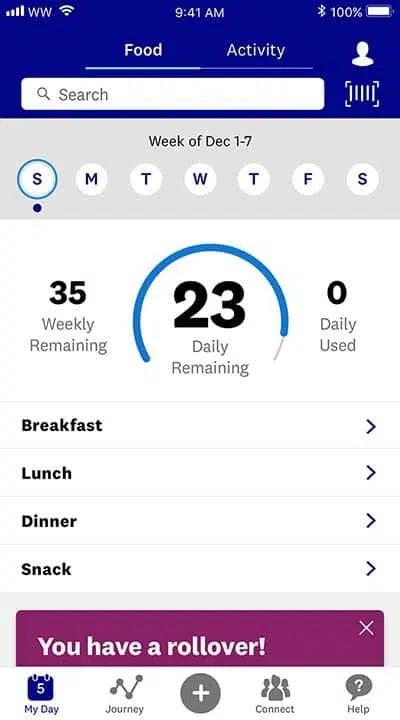
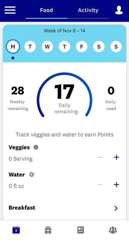
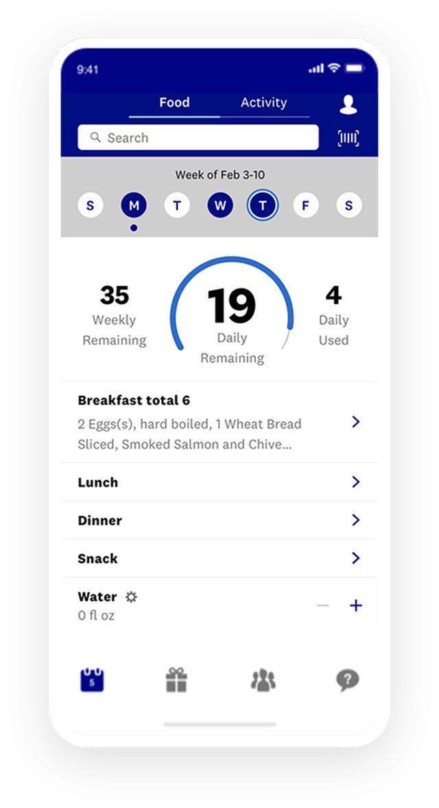
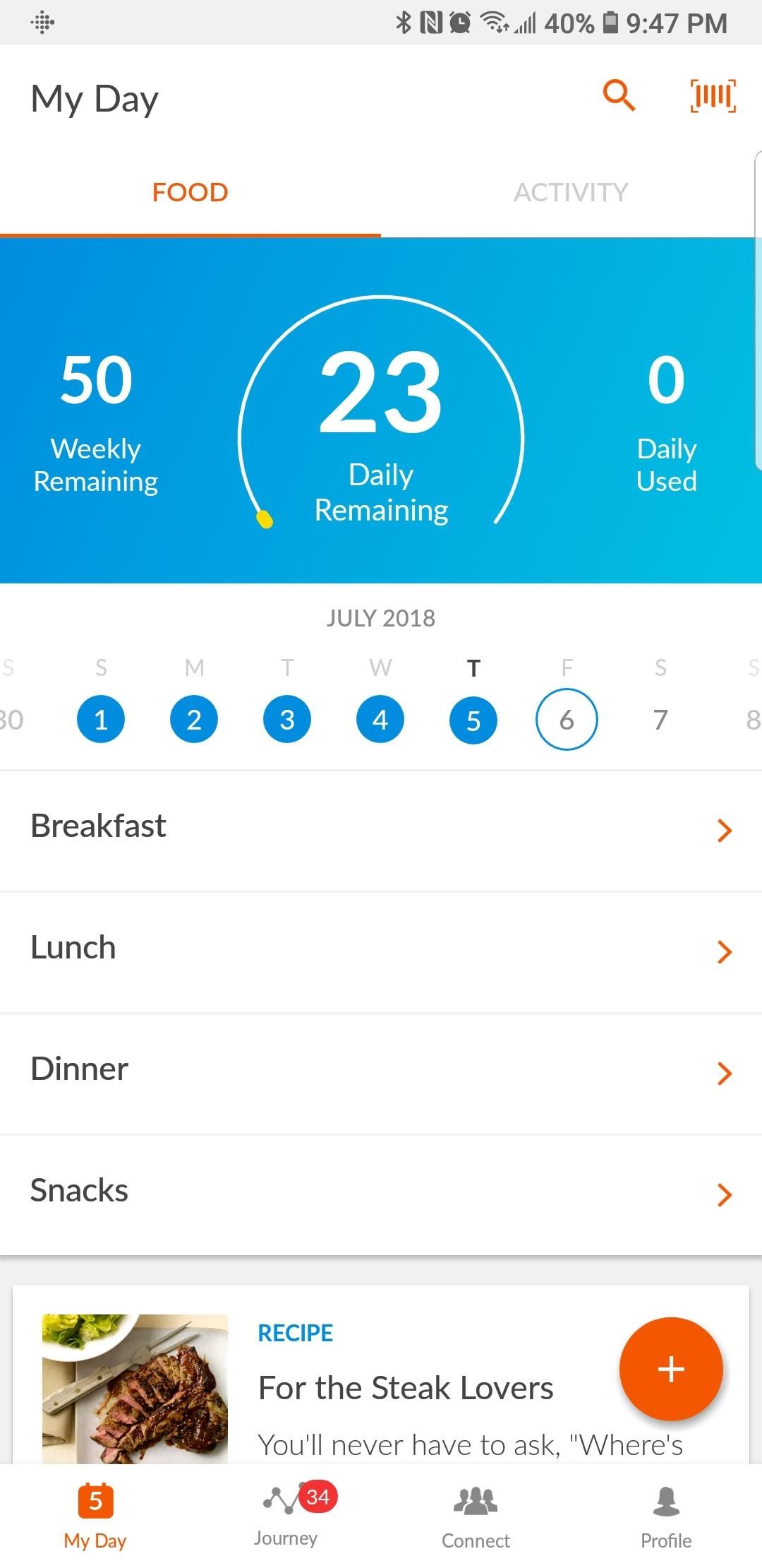
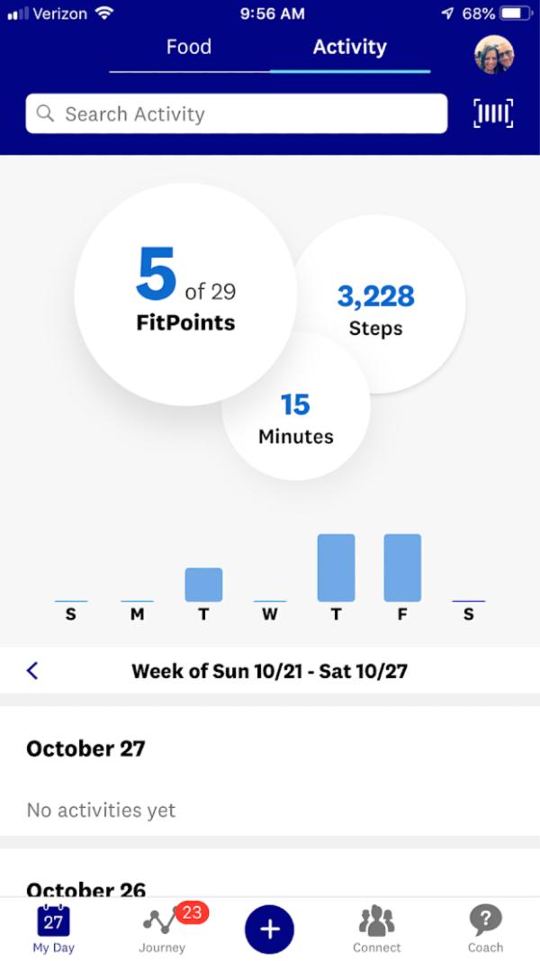
Previous App (2019)
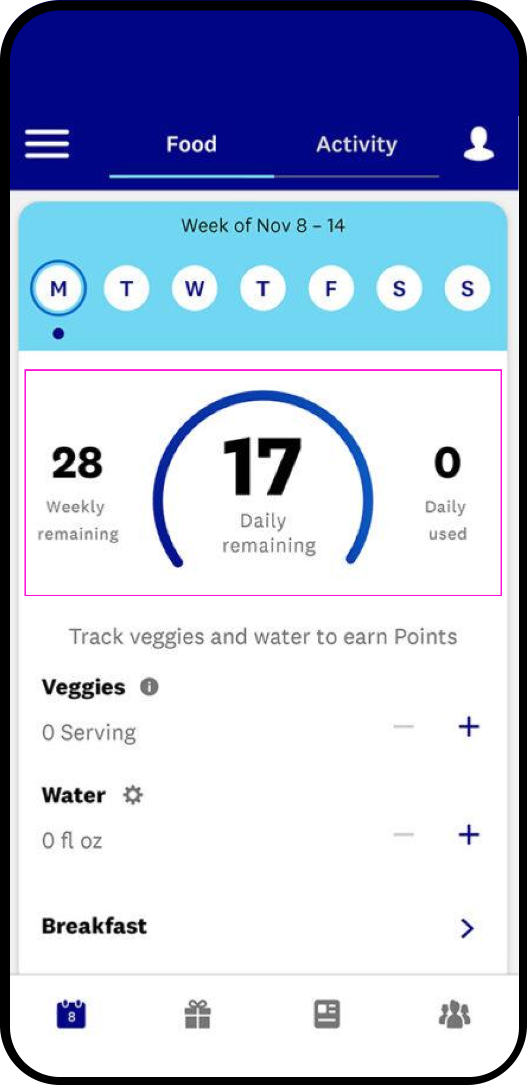
Previous App (2019)
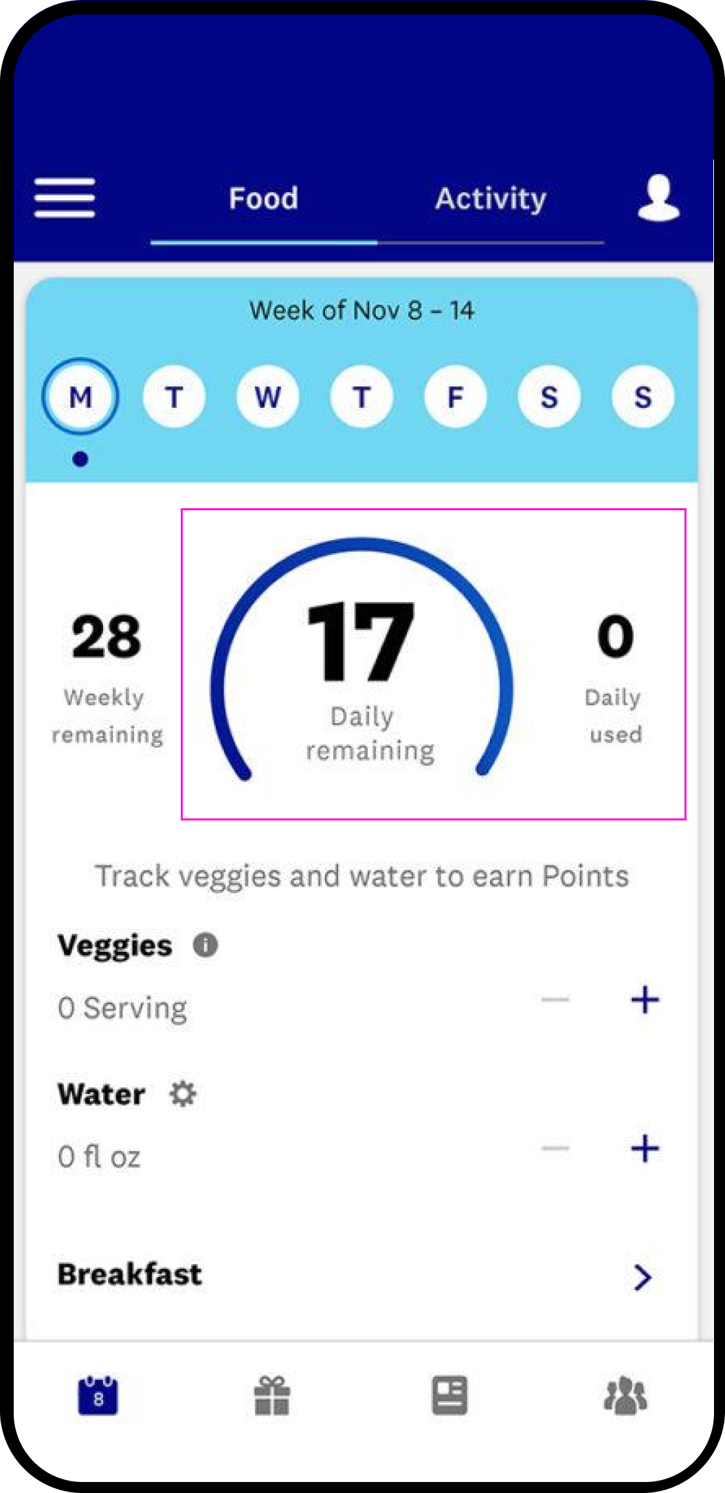
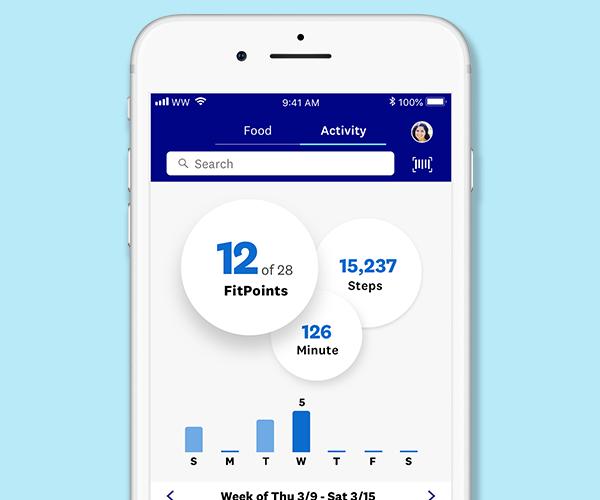
Redesign (2022)
.png)
2b. Simplifying the Three Mental Models - Points (Daily, Weekly, Total), ZeroPoints and Smartpoints
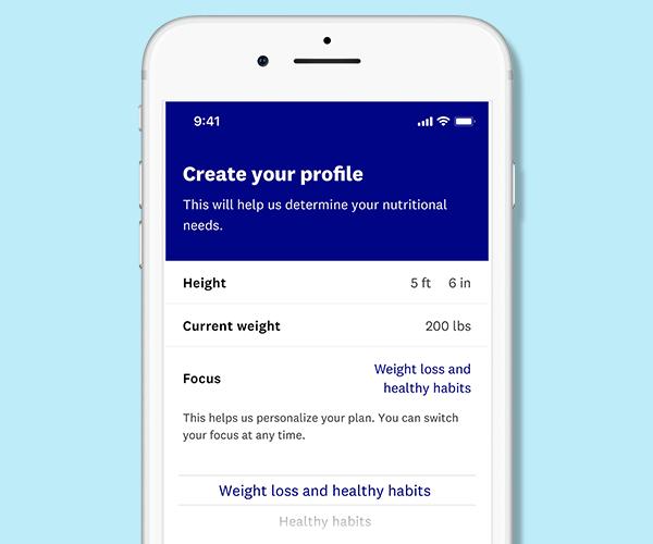
Reskinned Navigation tabs and introduced 'Weight' to further help personalization. Previous calendar is simplified to a dropdown in 'My Day.'
Weekly Points are 'bonus' points to use throughout the week on high daily point days - these remain unchanged.
Points are mapped via algorithm; by surfacing points per meal the contextual knowledge of how points are accumulated is strengthened and correlates directly to Daily Points.
Points (Daily, Weekly, Total)
.png)
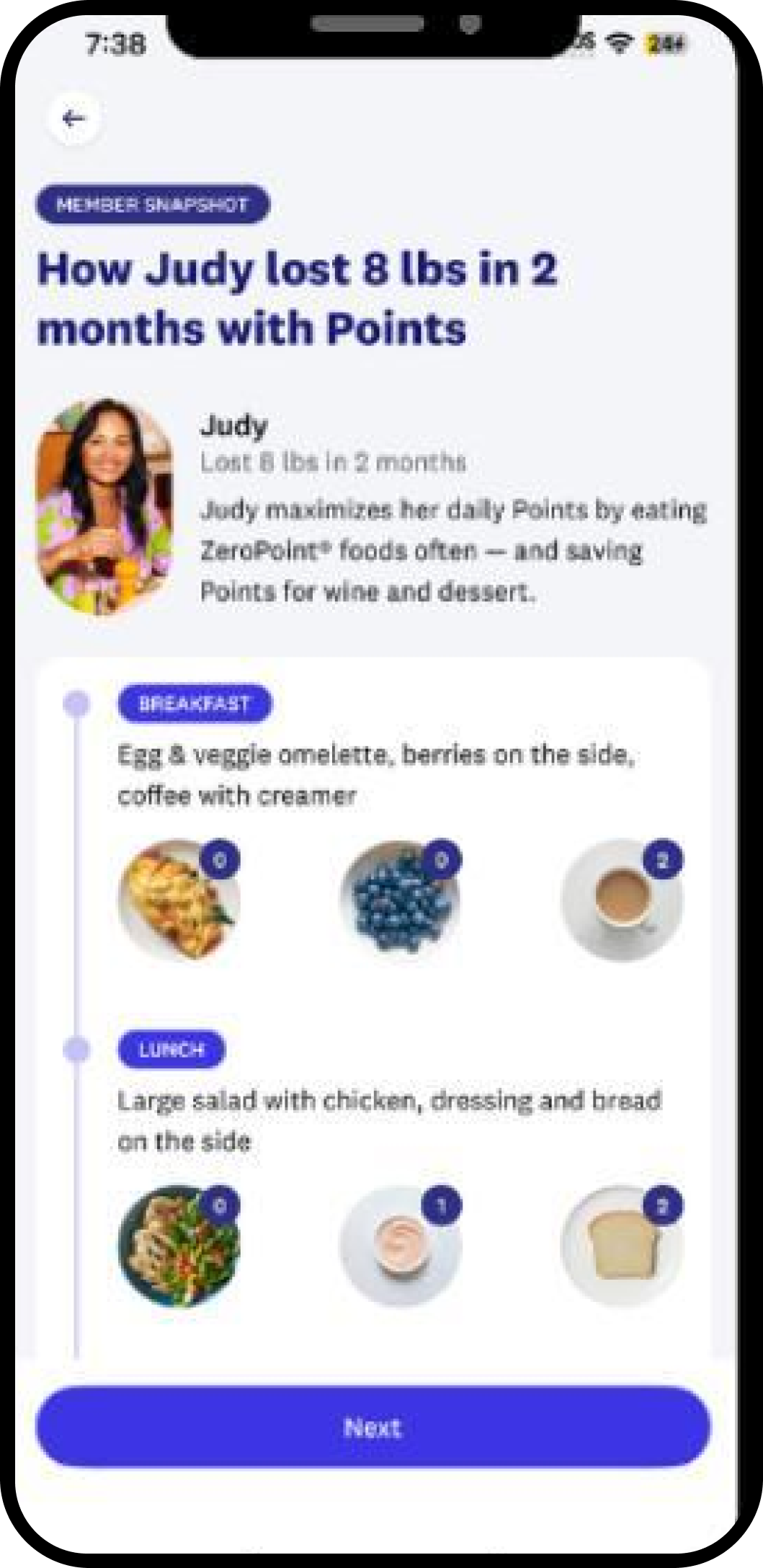
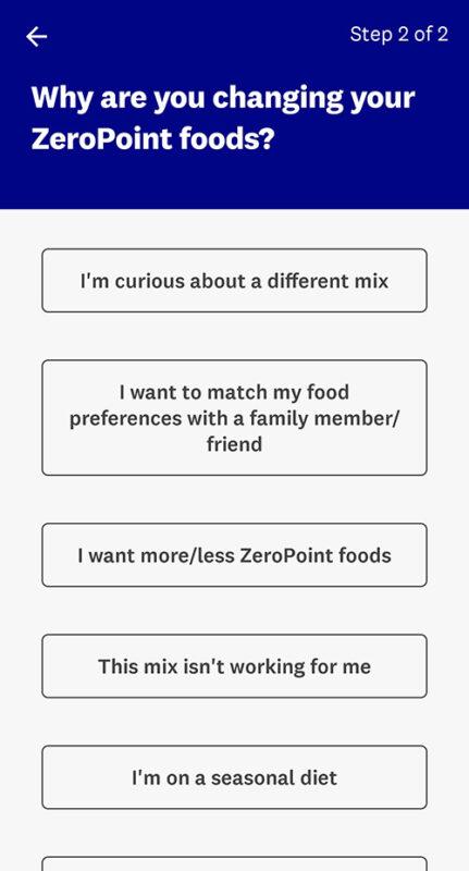
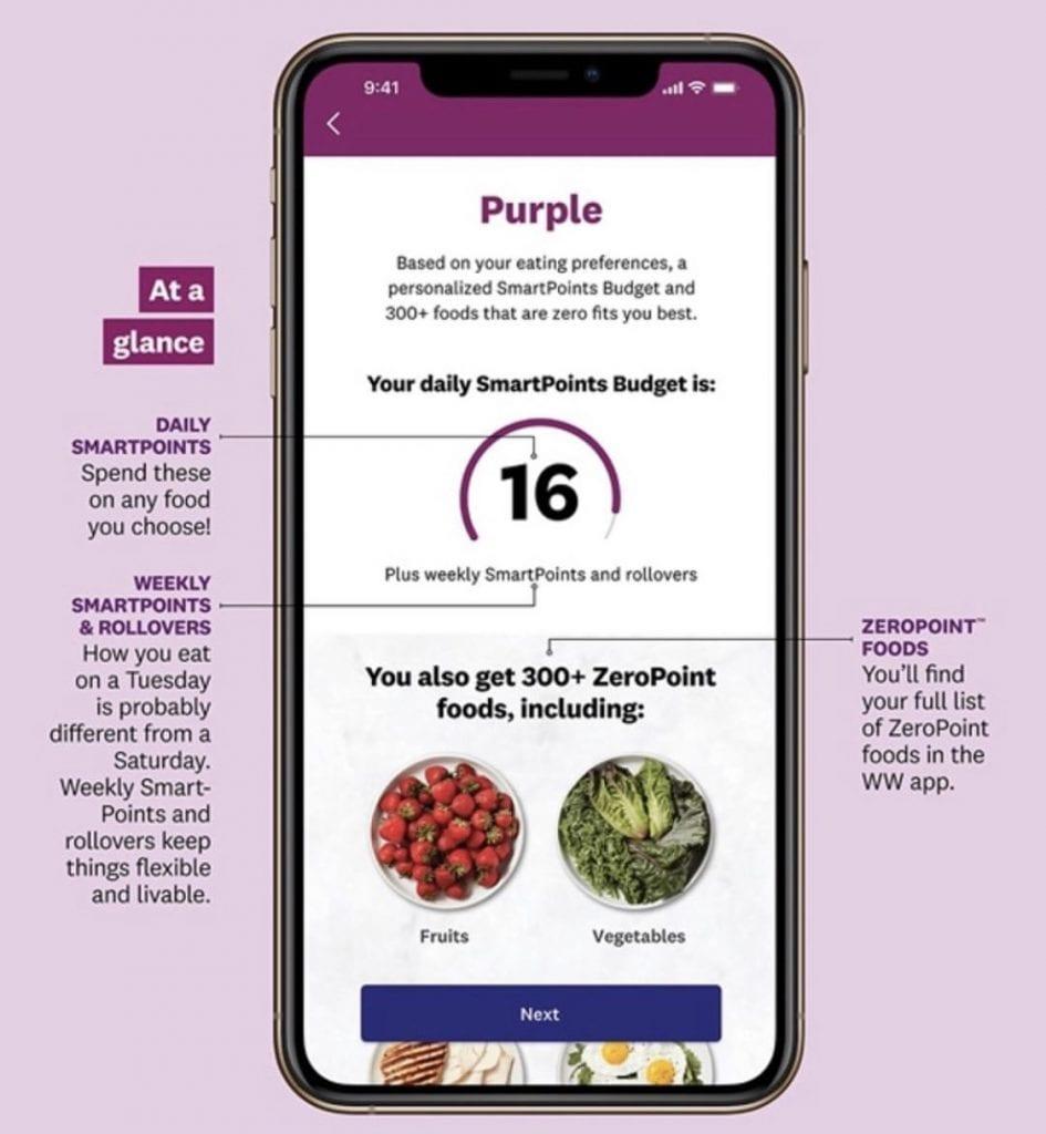
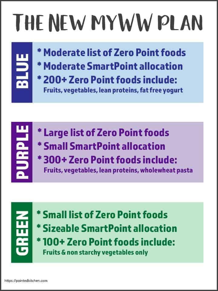
Zeropoints are foods with neutrality (hence 0 points) - introductionary onboarding was introduced geared towards first time users.
ZeroPoints Onboarding
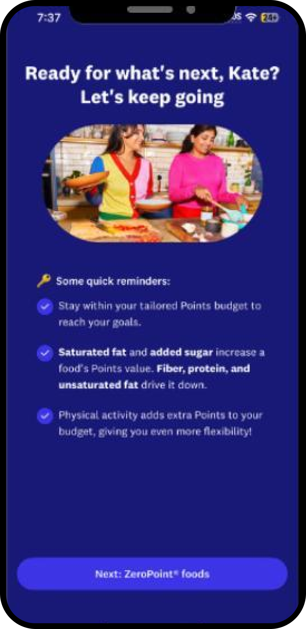
ZeroPoints
Zeropoints
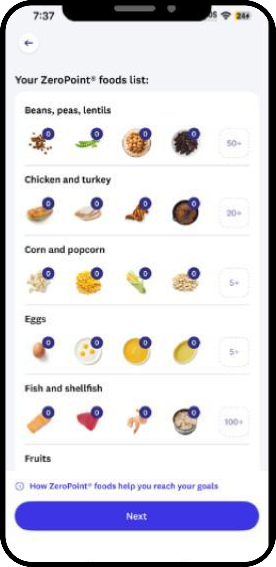
Zerpoint foods are given their own design treatment within the meal tracking section to easily identify what foods are 0 points.
ZeroPoints
.png)
Zeropoints
.png)
Smartpoints are subtractive points that are earned with excersize and weight loss. They're subtracted from the daily points tally.
Similarly to ZeroPoints, integration within the meal tracking section of the app bridges knowledge gap with daily context.
SmartPoints
.png)
SmartPoints
.png)
SmartPoints
.png)
2c. Eliminating Hidden Rules - Weeklies + Rollovers
Rollovers are now automatically calculated into the Weekly Points tally. Every 4 Daily Points unused = 1 Weekly Point added to the Total.
2d. Personalization
Progress Tab
.png)
Weight Toggle
.png)
Process
We focused on two types of testing with a sample group of 8 current WW users to get quick, real time feedback. Our first focus was to A/B test between the current WW app and the proposed prototype to establish that the new version is in fact more successful and preferred by users. Our second initiative was to test comprehesive ideas as well as task-based action in regards to the proposed design. Below is a bird's eye view of our testing.
3a. A/B Testing Current vs Proposed Designs
- Task Given
- Current UI
- Proposed UI
- Results observed
- 1. Find Points left today (time to complete)
- 3.6s avg
- 3.1s avg
- Reskin did not disrupt points comprehension (success)
- 2. Correctly distinguish Daily vs. Weekly Points (comprehension quiz)
- 88% correct
- 88% correct
- Reskin did not disrupt points comprehension (success)
- 3. Navigate to a recipe from My Day
- 3.4 taps avg
- 2.1 taps avg
- Reskin reduced friction
- 4. Self-reported confidence in tracking accuracy
- 3.2 / 5
- 3.9 / 5
- Modest improvement
- 5. App opens per day (behavioral, not task-based)
- 2.1
- 1.7
- Unexpected drop due to widget integration
- 6. "This feels harder to use than before" (existing users only, open text)
- —
- 14% of Group B
- Minority friction from users with old muscle memory
3b. Task Testing with the Proposed Design
Task given to participants:
You’re planning what to eat for lunch and dinner today. Use the WW app to decide which foods you might choose, based on your Points. As you make your choices, think aloud about what the Points numbers mean to you and how they influence your decisions.
Why this task
Points balance is the app's core decision-making input — this task tests whether the number actually functions as a decision tool, or just a passive tracker people check after the fact.
Method
Moderated, 1-on-1, think-aloud, ~15 min per session, 8 participants (mix of new and 6+ month users).
- Task Given
- What we found
- Post MVP Changes
- You’re planning what to eat for lunch and dinner today. Use the WW app to decide which foods you might choose, based on your Points. As you make your choices, think aloud about what the Points numbers mean to you and how they influence your decisions.
- Most participants (6 of 8) treated their remaining Points as a hard ceiling and picked the lowest-Point option available, even when it wasn't what they actually wanted to eat — several said things like "I'll just pick whatever's cheapest, I can have what I want tomorrow"
- Reframe the Points display from a single depleting number to a "budget remaining across today + this meal" view, showing both the daily total and a per-meal suggested range
- 3 of 8 didn't factor in Weekly Points at all during the task — when asked why, they said they "forgot those existed" or thought they were for special occasions only, not everyday lunch/dinner decisions
- Add a one-time contextual prompt during meal-selection flow: "You have X Weekly Points available too — want to use some today?"
- When comparing two food options, participants had to leave the selection screen and go back to My Day to check their remaining balance, then return — this broke their flow mid-decision (avg. 2.3 screen switches per meal decision)
- Add remaining Points balance directly inline on the food search/selection screen, updating live as items are added
- Several participants (4 of 8) said the number itself felt emotionally loaded — one described feeling "guilty" seeing a low number, another said a high number felt like "permission" — this shaped food choice more than nutritional content did
- Not a UI change, but flagged as a content/tone finding — recommended softer framing in copy near low-Points warnings (e.g., avoiding red/urgent styling) to reduce guilt-driven decisions
- Overlap with What to Eat tab: only 2 of 8 thought to check recipes there during the task — most tried to mentally estimate Points for meals they already had in mind rather than browsing Point-friendly options
- Surface "Recipes under X Points" suggestions directly during the lunch/dinner planning flow, pulling from What to Eat
Process
Weight Tab MVP Interaction
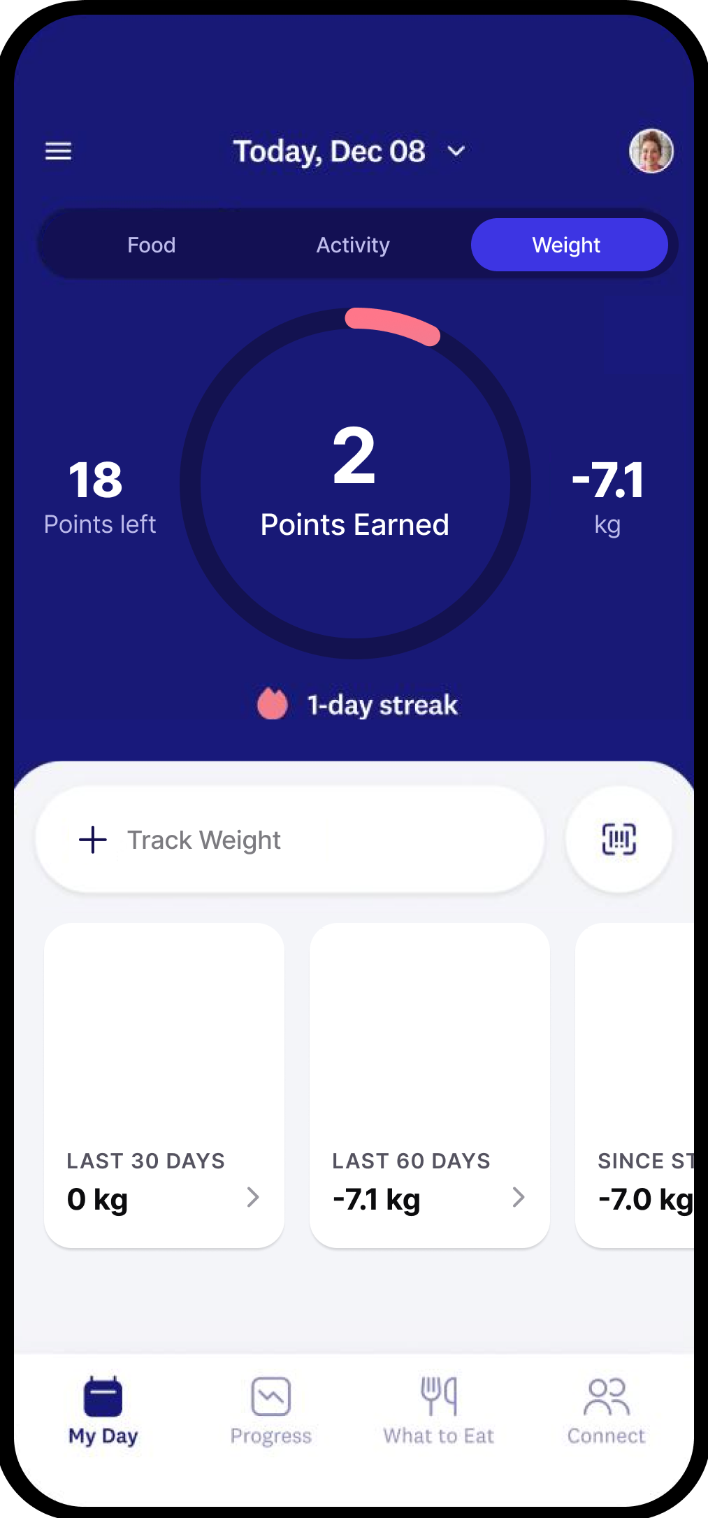
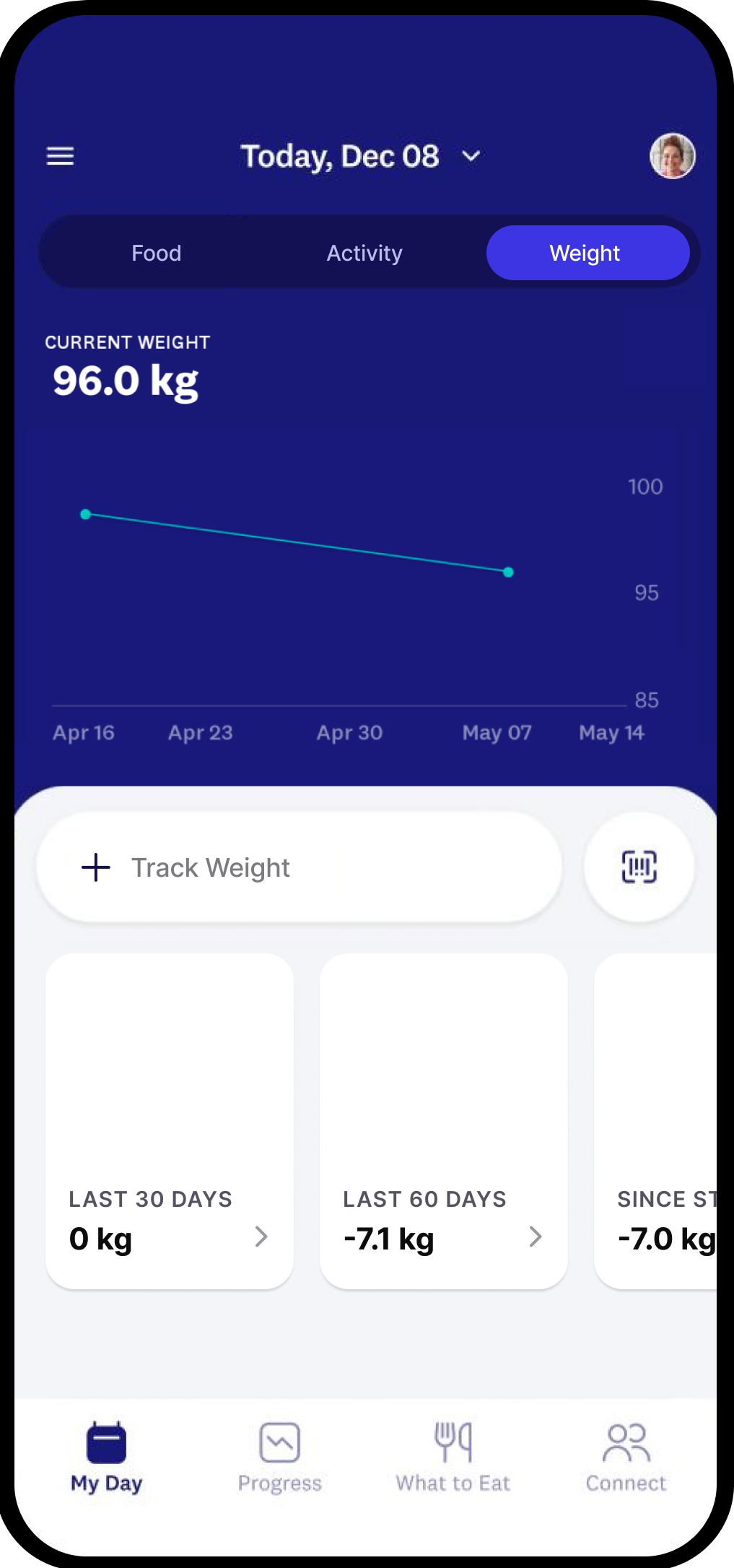
Instead of a Points based approach; we tried a charting system to track weight-based changes.
Time vs. Body Composition
By changing the tracking section from time to body specifics the user is given a stronger understanding of what's working and what needs improvement.
Third party integrations (Apple Watch, Whoop, Oura, etc) are incoorperated to track body composition.
Round 1
Round 2
Final Round
.png)
Process
I worked across Product, Research, Design, and Engineering to determine where we could simplify the experience without simplifying away the underlying sophistication.
- Design system & UI architecture — Partner with engineering early to translate the new visual language into a scalable design system: tokens, components, states, accessibility, responsive behavior, and reusable patterns. Align on what can be reskinned versus what requires structural changes.
- Technical feasibility & prioritization — Collaborate upfront on technical constraints, legacy dependencies, performance considerations, and platform differences (iOS/Android). Identify the highest-impact redesign opportunities and separate “visual reskin” work from deeper UX/product changes so scope and effort are clear.
- Prototyping, QA & design fidelity — Work closely with engineers during implementation through interactive prototypes, design reviews, and visual QA. Establish a tight feedback loop to catch spacing, typography, motion, interaction, and accessibility issues before release rather than treating QA as a final handoff.
- Iteration & measurable outcomes — Partner with engineering, product, and data to instrument the redesigned experiences and evaluate whether the new UI improves engagement, task completion, conversion, retention, or other key metrics. Use those insights to continuously refine the experience rather than treating the reskin as a one-time launch.
Takeways
The redesign is an opportunity to create a more connected and intelligent WW ecosystem—not just a visual refresh. Expanding integrations with platforms like Oura, Apple Health, Garmin, Fitbit, and WHOOP could bring sleep, activity, heart rate, recovery, and other biometric data into one experience. AI could then synthesize these signals with nutrition and behavior data to provide personalized, proactive guidance rather than simply displaying metrics. The goal is to move from “track and interpret” to “understand and guide,” helping members make better decisions in the moment. Privacy, transparency, and user control should remain foundational as biometric data becomes part of the WW experience.

.png)
.png)
.png)